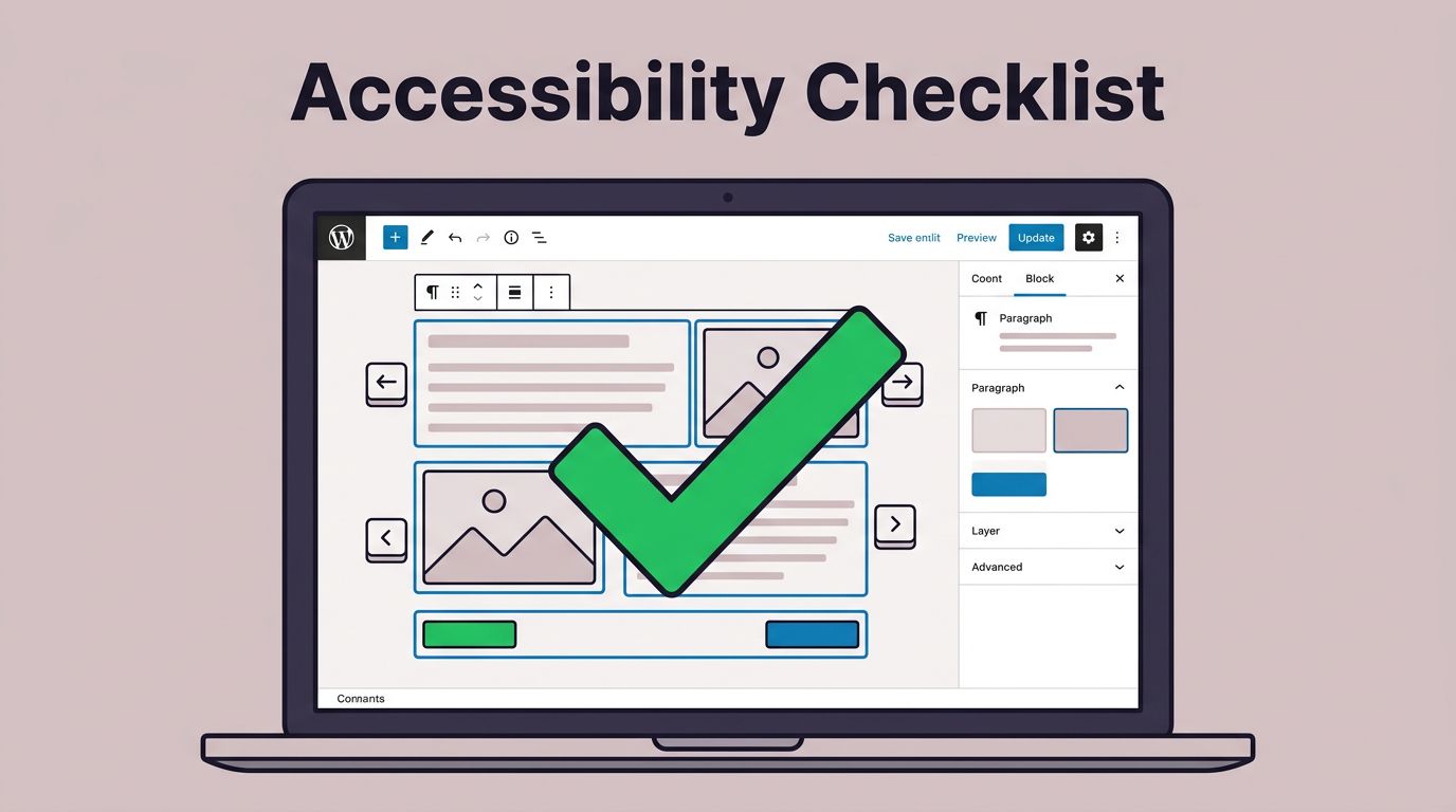
WordPress Accessibility Checklist for Bloggers Using Block Themes (2026)
Table of Contents
If you publish on a WordPress block theme, accessibility can feel like one more thing to remember. Still, it’s not a “nice-to-have.” It’s the difference between a post that feels welcoming and one that feels like a locked door.
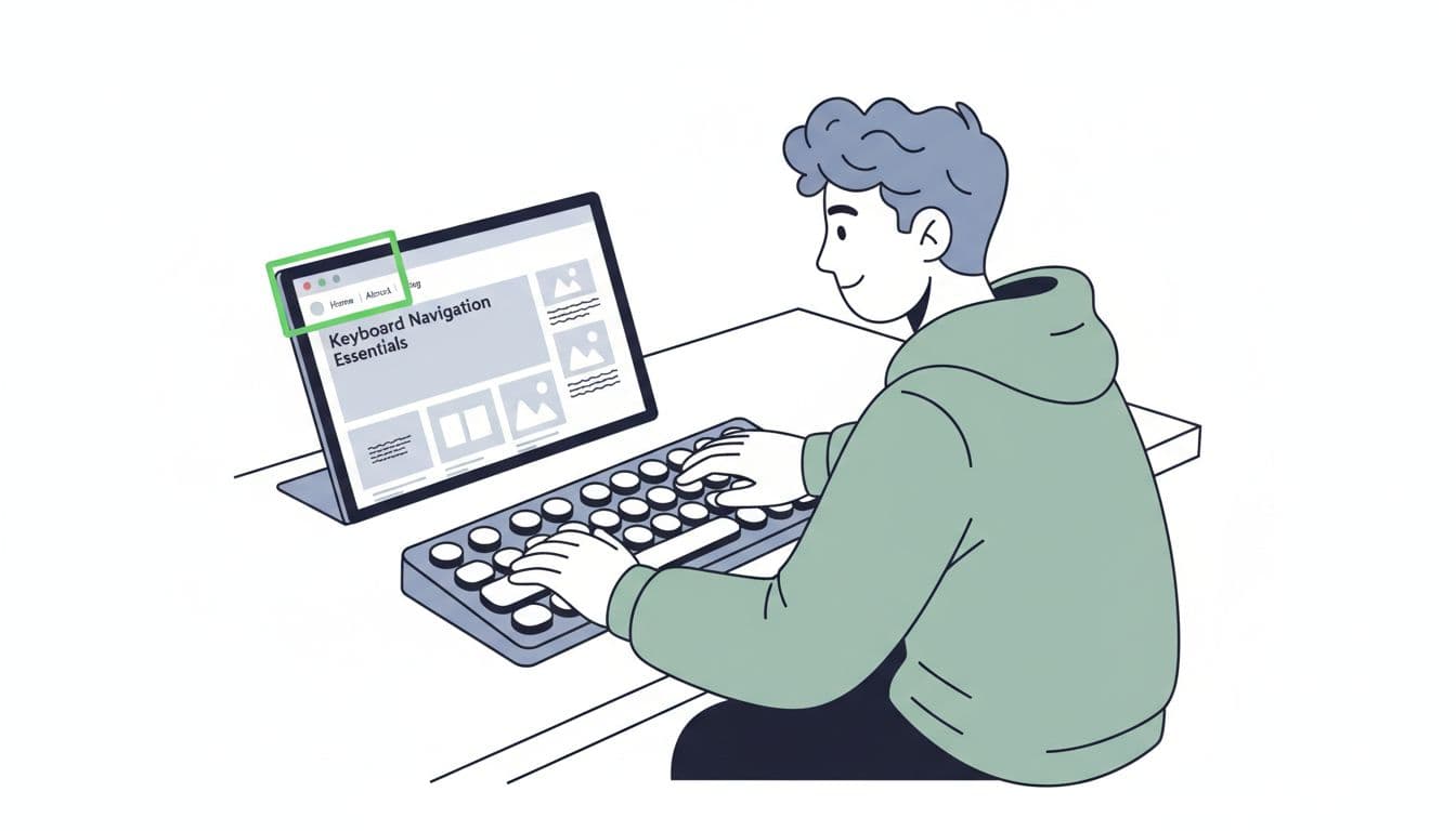
I learned this the hard way after testing my own site with only a keyboard, a step vital for improving the user experience for readers with visual impairments. I got stuck in my header menu like it was a maze. That one moment changed how I publish.
This WordPress accessibility checklist is the practical version I wish I had earlier. It’s built for bloggers using Full Site Editing to achieve accessibility-ready block themes while following WCAG standards, and it focuses on what you can control, your theme, your templates, and your content.
Theme and template checks (keyboard navigation, focus, skip links)
Block themes shift a lot of layout work into templates and template parts that organize content with ARIA landmarks. As a result, accessibility issues, especially around keyboard navigation, often live in the header, navigation, and global styles, not inside your paragraphs. Through manual testing, these checks help create an accessible theme that meets WCAG criteria for site structure.
Here’s the set of checks I run when I switch themes or tweak my header:
- Keyboard-only navigation works: I can Tab from the browser bar into my page, through the menu, into the post, and to the footer without getting trapped.
Why this matters: some readers can’t use a mouse, period. - Visible focus indicators are obvious: The focused link or button has a clear outline, not a faint color shift.
Why this matters: keyboard users navigate by focus, like a flashlight beam. - Dropdown menus open and close by keyboard: Tab and arrow keys behave sensibly in the Navigation block.
Why this matters: a menu you can’t operate is a dead end. - Skip link exists (or you add one): I can skip past the header straight to main content.
Why this matters: otherwise, keyboard and screen reader users hear your menu on every page. - No “Spacer-only” layout hacks: I use padding, margins, and Group block spacing instead of stacking Spacer blocks for layout.
Why this matters: spacers can create awkward reading and tab order. - Link targets aren’t tiny: Buttons and nav links have comfortable padding.
Why this matters: small targets frustrate mobile and low-vision users. - Animations don’t cause problems: Auto-rotating sliders and parallax effects are minimal, or off.
Why this matters: motion can trigger nausea or distraction.
If your theme’s focus outline is weak (or removed), a small CSS tweak often fixes it. In many block themes, you can add CSS through the Site Editor. For context on where those controls arrived, I like this rundown of Full Site Editor updates in WP 6.2. My go-to one-liner is: :focus-visible { outline: 3px solid #22C55E; outline-offset: 2px; }
Quick gotcha: If you can’t see focus on buttons, it’s usually not your content. It’s theme styles overriding outlines. These tweaks go a long way toward an accessible theme.
Headings and structure inside the Gutenberg block editor (so screen readers don’t get lost)
When a screen reader hits your post, headings act like chapter markers. Without them, the experience feels like listening to a podcast with no track list.
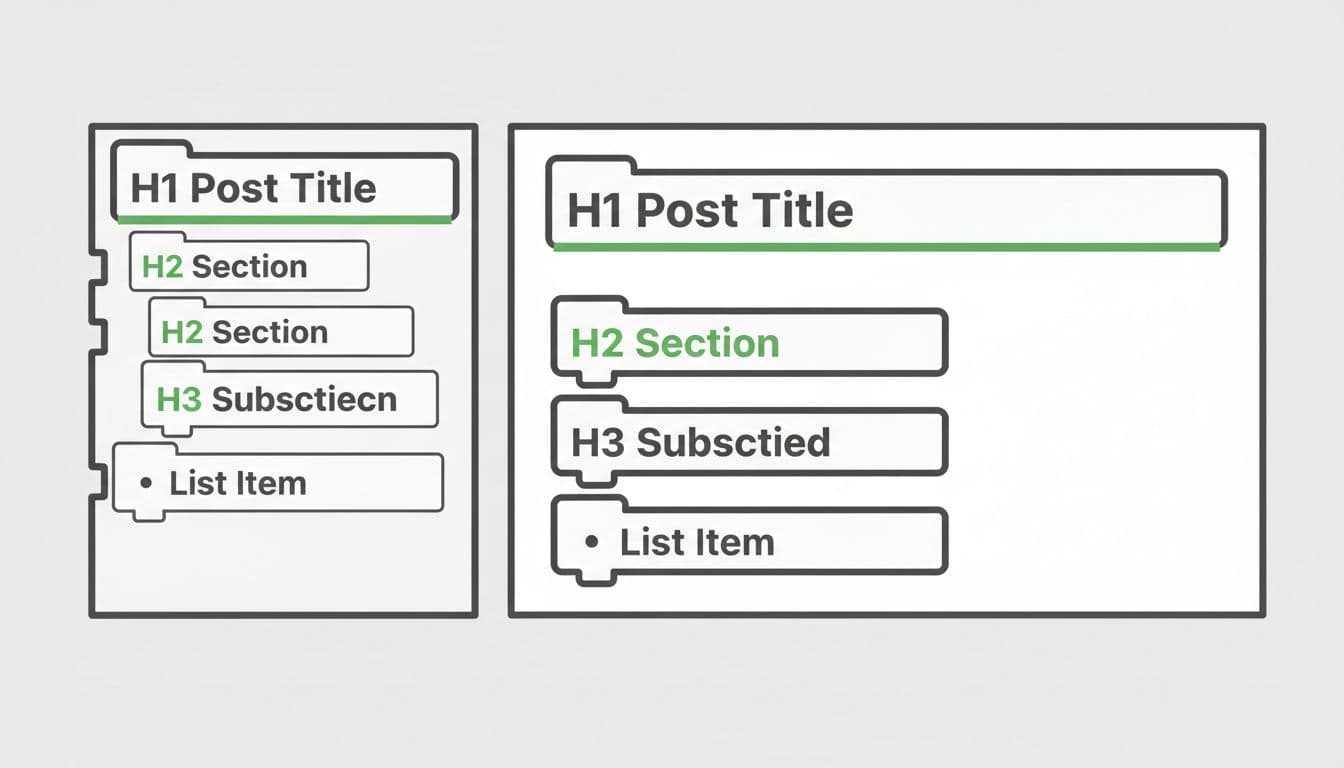
These are the heading structure rules I follow in every post:
First, I keep one H1, and I let WordPress handle it as the post title. Next, I use H2 for main sections, then H3 for sub-sections. I don’t jump from H2 to H4 just because I like the font size. If I want smaller text, I adjust the block style, not the semantic level.
Lists matter too. If something is a list, I use the List block. I don’t type “1)” and “2)” in paragraphs. Screen readers announce real lists properly because they follow semantic HTML, which helps screen readers and other assistive technology interpret the page layout and understand the shape of your ideas.
Links and buttons are part of structure as well. I write descriptive link text that makes sense out of context. “My newsletter setup guide” works. “Click here” doesn’t. For Button blocks, I treat the button label like a sign on a door. It should say where it goes.
Finally, I avoid using headings as decoration, maintaining proper heading structure. A heading should introduce content, not just create space. In block themes, it’s tempting to “design” your way into problems. I try to keep my templates and posts readable first, stylish second.
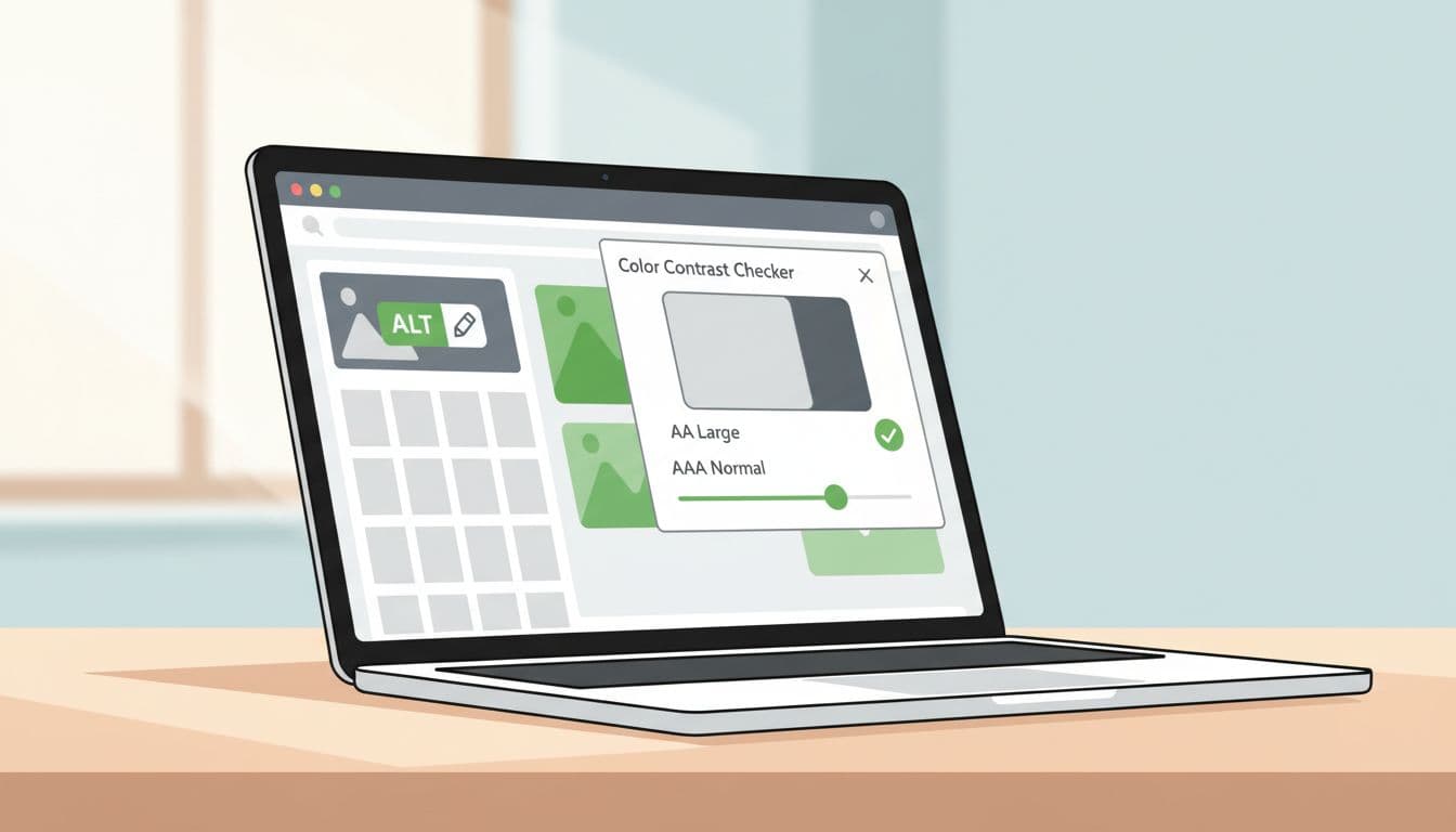
Images, alt text, and color contrast checks (the stuff readers actually notice)
Most bloggers (me included) think about images as mood and branding. Accessibility asks a different question: “What info does this image add?”
My rules are simple:
I add alt text in the Media Library when the image is informative, like a screenshot that shows a setting, a chart, or a step. If the image is purely decorative (a divider flourish, a background texture), I keep alt text empty when WordPress allows it, so screen readers don’t read junk.
I also use captions when they help everyone, not only screen readers. A caption can explain why the image is there, which is often more useful than a literal alt text description.
Then there’s color contrast. Block themes make it easy to pick pretty color palettes, and that’s also how people accidentally create low color contrast text. I do a quick color contrast check for WCAG guidelines:
- Body text on background (aiming for WCAG 2.1 level AA color contrast ratios)
- Link color against body text
- Button text against button background
- Any text placed on top of images (I avoid this when I can)
These WCAG-aligned checks also benefit users with cognitive disabilities by ensuring clear, readable design. For multimedia like videos alongside images, I provide multimedia transcripts. Plus, they help satisfy Section 508 standards.
If you want a broader reference point for what “good” looks like in 2026, this WordPress accessibility checklist for 2026 is a helpful sanity check. I don’t try to memorize standards, I just use them to catch obvious misses.
Tools I use + my 10-minute pre-publish accessibility routine
Accessibility doesn’t need a full afternoon. I treat it like brushing my teeth. Small habit, huge payoff.
My recommended workflow (fast, non-developer)
I keep three quick tests in rotation:
- Keyboard-only pass: Tab, Shift+Tab, Enter, arrow keys. I check menus, search, and any buttons.
- Screen reader spot-check: I use VoiceOver on Mac and NVDA on Windows when I can, both popular screen readers. I listen to headings, links, and image announcements.
- Contrast + automated scan: A contrast checker plus automated testing tools like the WAVE evaluation tool (browser extensions or Lighthouse) catches easy-to-miss issues.
If you want something inside WordPress that nudges you while you build pages, the Block Accessibility Checks plugin can be a solid helper, especially for common block-level mistakes and basic WCAG compliance.
My simple pre-publish routine (accessibility audits, in order)
- I skim headings in the List View, making sure H2 and H3 levels make sense.
- I Tab through the post from the top, watching for a clear focus outline.
- I open images in the editor and confirm alt text for assistive technology, or intentionally leave it empty for decorative images.
- I check every button and link, reading it out loud to see if it’s descriptive.
- I run one automated scan, then fix only the real issues, not noise.
- I do a 60-second screen reader listen for the intro, one section, and the footer.
- I confirm or add an accessibility statement linking to WCAG guidelines.
This routine helps ensure ADA compliance and meets requirements for the European Accessibility Act.
For deeper background on block-based accessibility practices (especially if you work with custom patterns), this guide to accessibility best practices for WordPress block design explains the “why” behind many of these habits.
Conclusion: publish like every reader matters (because they do)
I don’t aim for perfection, I aim for progress I can repeat. When I run this WordPress accessibility checklist, my posts feel cleaner, my templates behave better, and I spend less time fixing complaints later. It’s a tool for ongoing user experience improvements.
If you take only one step today, make it this: do a keyboard-only pass and fix focus visibility. It’s the quickest win with the biggest impact. As a finishing touch for engagement, check your accessible forms.
These steps empower users of assistive technology and those with visual impairments.
What’s one part of your block theme that feels hardest to make accessible, the menu, the colors, or the templates?